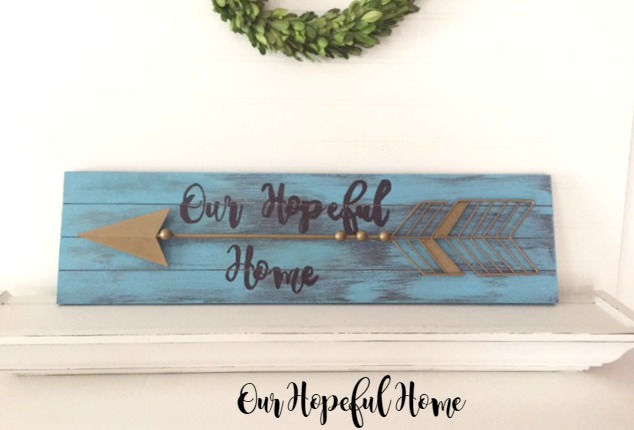
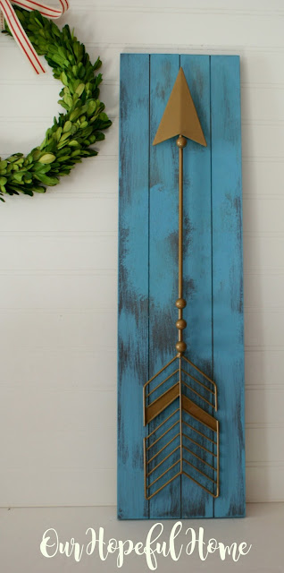
Rustic arrow wall art has been all the rage for quite some time now. Have you noticed? While I'm not one to run out and pick up the latest home decor fad, I am one who loves a DIY challenge. A few months ago I purchased a piece of clearance wall art that I didn't particularly love. But I knew it had potential. And once I got it home I got to work.
Here it is, a rustic looking faux wooden plaque with a metal arrow attached. I picked it up on clearance for $4.00. I liked the idea of a rustic wooden sign and an arrow, I just knew that I could make it better with some plain old DIY ingenuity.
I wanted to paint it a turquoise color to go with my family room colors and gallery wall. (You can always take a moment to read about my gallery wall reveal to see what I mean. Go ahead, I'll wait.) But I didn't know how to paint the plaque and not paint the arrow. Until I gave the arrow a good yank out of frustration -- and out it came!
The board itself was nothing to write home about. It appeared to be some form of laminate. It was just crying out for some color!
While I debated spray painting the metal arrow as well, I realized that it would go perfectly with the trio of arrows that were already on the wall, as well as with the overall gold touches such as the gold frames and gold sunburst mirror. So untouched it remained.

See what I mean about the color? These were actually three separate arrows that I glued together to create a custom piece of art for the gallery wall. One day I'll share how I did it. (Trust me, it wasn't easy. Have you ever tried to glue three poles together at an angle?)
I used DecoArt's Americana Decor Chalky Finish Paint in Escape. I received the paint from DecoArt as swag for attending a blogger's conference in Chicago last summer. (All opinions are my own.) Ironically, I first used this pleasantly chalky paint on another old sign transformation that I ended up being very happy with, so I knew I would end up happy with this one, too.
I hadn't used the paint in a while so it was pretty thick and really needed a good stirring. But something told me to just leave it as it was. And I loved it.
Basically I dry brushed it, which gave it the vintage, rustic look I absolutely love. Easy peasy. Then came the hard part, at least for me: choosing what words and font to use.
I'm not sure why I have such a problem with this. Maybe it's because I'm afraid I won't like it after all is said and done. I considered at least six different sayings and oh, around 20-plus different fonts. I kid you not. Until I finally realized the best, most perfect words I could ever put on it: Our Hopeful Home. And the font? Why, my blog header font, of course.
After playing around on the computer I finally decided on the right size for the words. I printed them out as a test to be sure they would indeed fit.
So far so good. I decided I didn't feel like making my own stencils for this particular project (as I've been known to do in the past). That left me with the reverse transfer method I first introduced at Easter a few years back. I wasn't totally sure it would work on the painted wood surface but I wanted to give it a try.
Reverse Chalk Transfer Method In a Nutshell
1.Turn the printed words or image you want to transfer face down on the table.
2. Then you rub a piece of chalk over the back side of it, making sure that you cover the entire word or image with a chalky coating.
3. Flip the image face up and place it where you want it to appear on your project.
4. Tape it down with painter's tape so it stays in place.
5. Then outline each letter or image with pencil, and go back and fill in each letter or image with pencil as well.
When you're done you can pull up the paper and you'll have a faint chalk outline of the words or image to use as your painting guide.
Once that was done, I went back and carefully filled in all the chalked letters with a gray paint pen. I really thought that gray would look fabulous on blue. I was wrong. No time for feeling disappointed! Plan number 2: when all else fails, use a Sharpie.
Um, no. I thought it looked awful and was very disappointed. I'd never used a Sharpie on my projects before but I'd seen so many other bloggers do it that I thought it would work on this. Only no one ever mentioned that Sharpie has a different look to it than paint does. The words had a glossy sheen to them. Just the opposite of what I wanted for my rustic looking sign. Sigh. Back to the drawing board.
Next up: gold paint. It, too, looked awful. So awful, apparently, that I didn't even take a picture of it. Probably for the best. So after all that work I was left with a sign I didn't like. After the requisite pity party I untwisted my knickers and painted OVER the gold letters with the original blue.
Hallelujah.
I can definitely live with this.
It took two coats to cover the words and it kind of ruined the distressed look I had going. (Since the underlying "wood" was actually laminate I couldn't really distress it to match the rest of the dry-brushed sign.)
But I'm still pretty darn happy with it.
While I'm not thrilled with the fact that the sign has NO words on it, I'm much happier with it than I was before. I guess the lettering was just not meant to be. But my reverse chalk transfer method still stands! That part worked really well. I'll be sure to share once I actually hang it on our gallery wall.
Well, that's it until next time!
I hope you enjoyed reading about my DIY Rustic Wooden Sign With Arrow.
Thanks for spending time with me today!
Be sure to stay in touch:
Just click on my Facebook, Pinterest, Twitter or Instagram icons in my top right sidebar. You can also sign up there to receive my blog posts via email as well.
Don't forget to Pin it!
.Don’t miss another thrifty,
DIY home décor post!


Leave a Comment!
Oh well, some things don't work out like we envisioned, but still like the paint color on the wood...that was a big improvement!
It can be frustrating when our creative vision takes a detour but your perseverance paid off!
Post a Comment